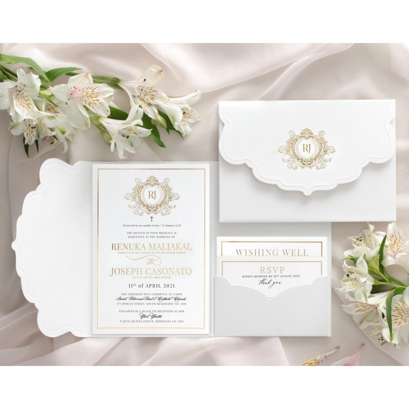
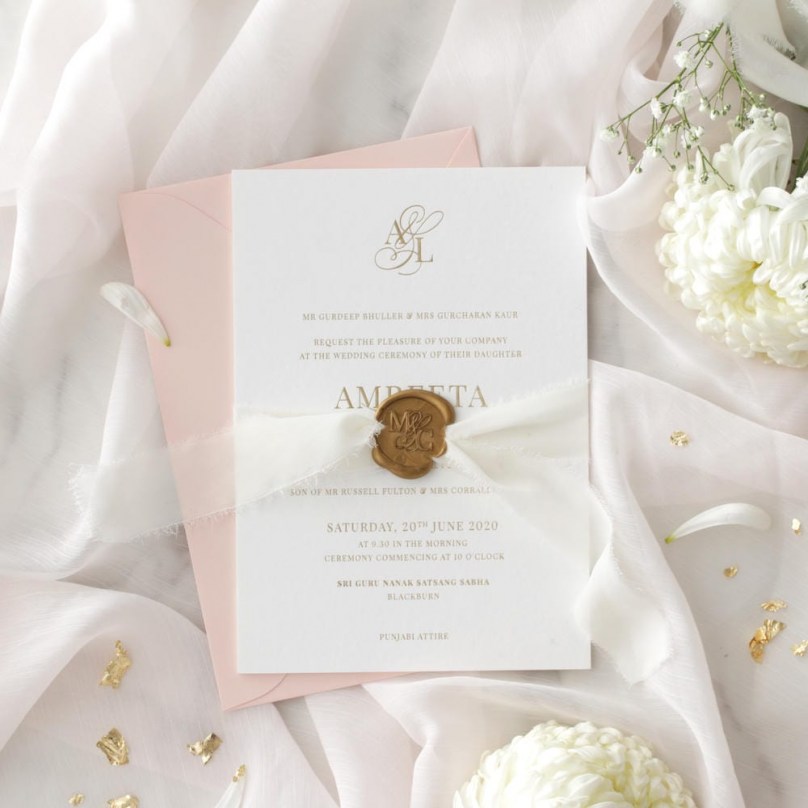
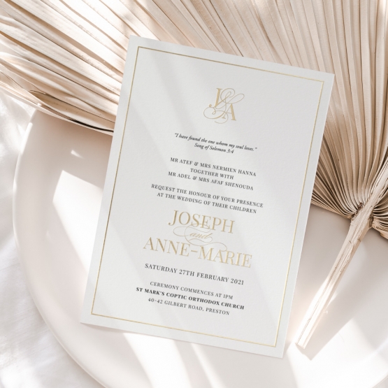
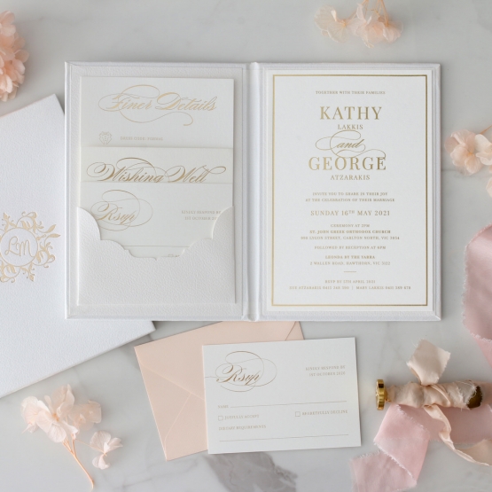
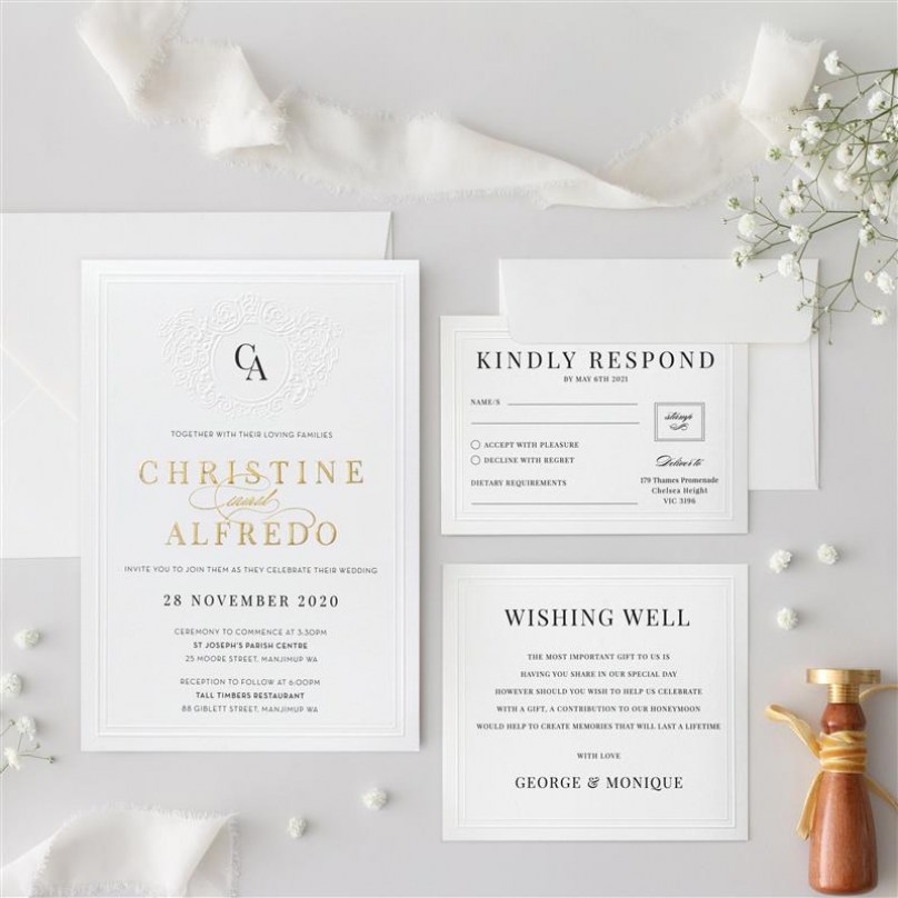
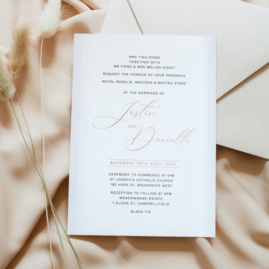
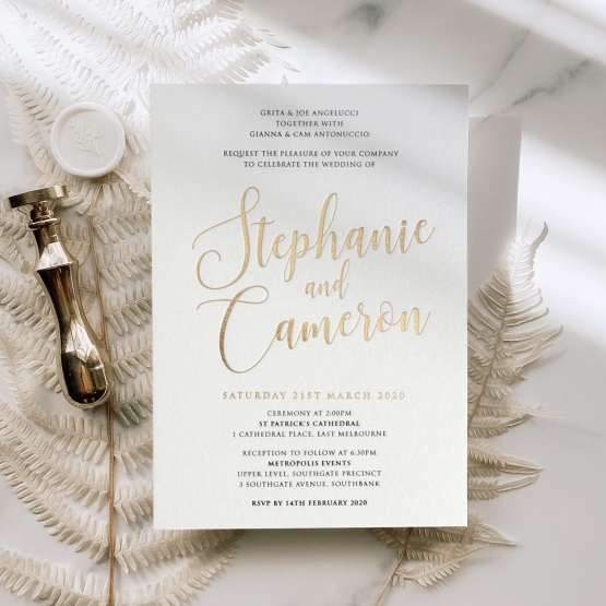
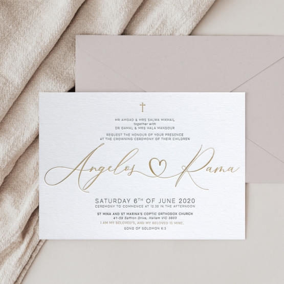
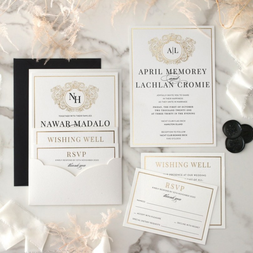
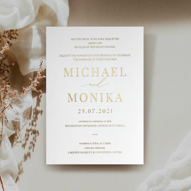
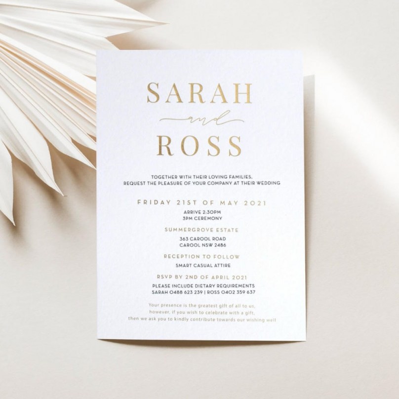
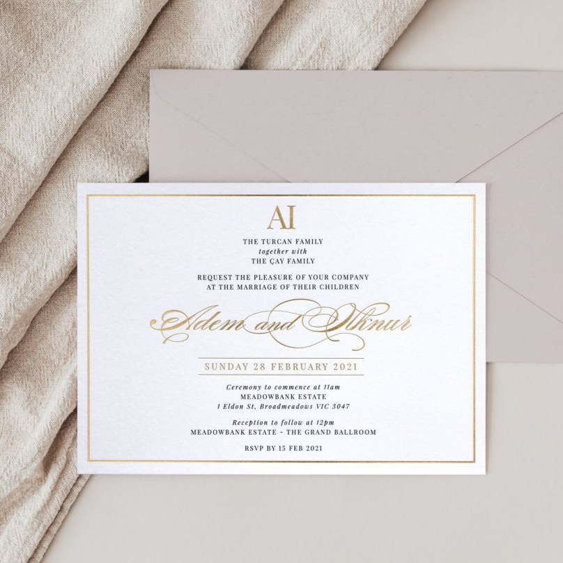
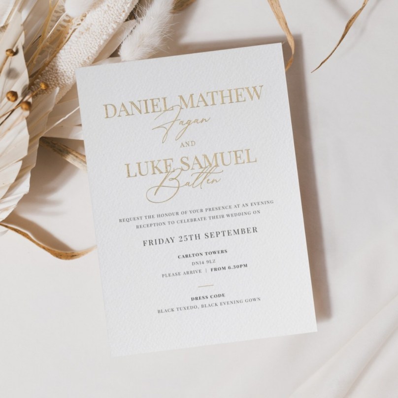
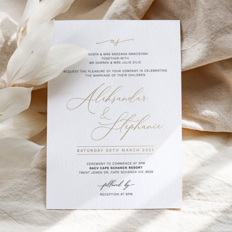
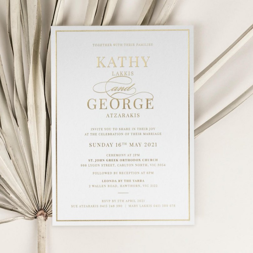
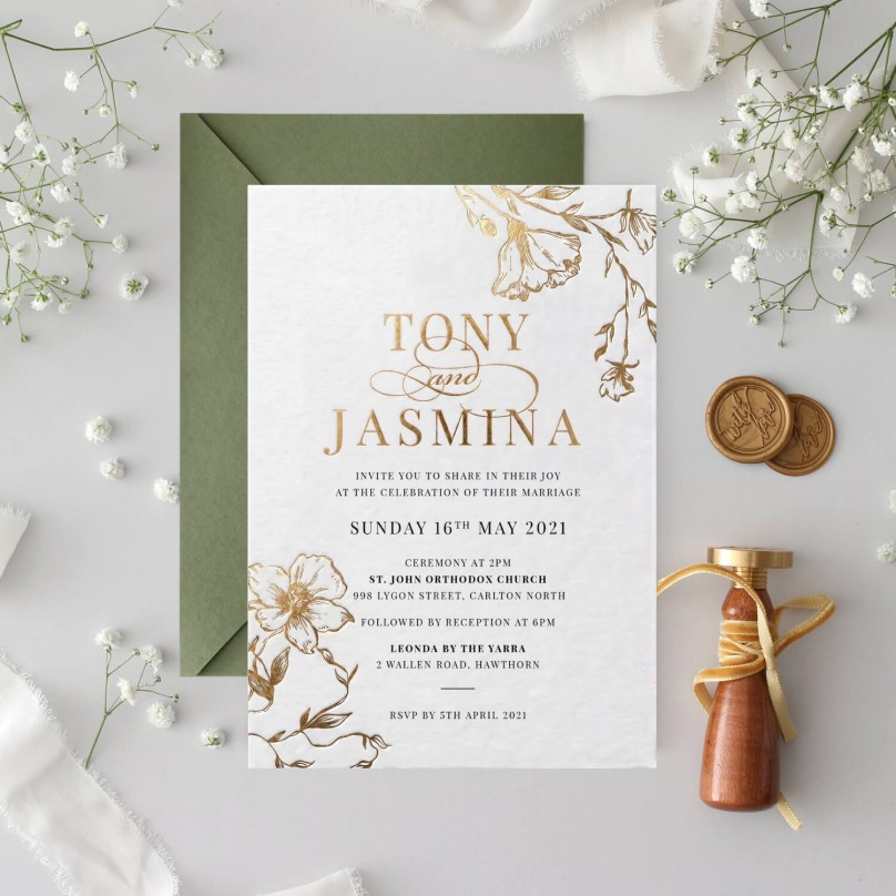
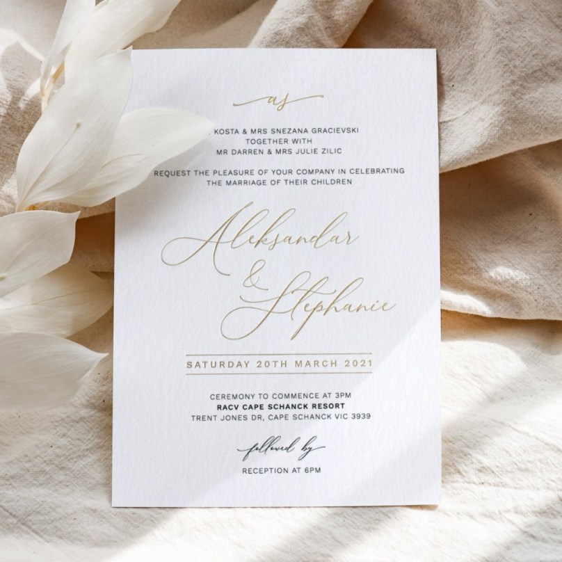
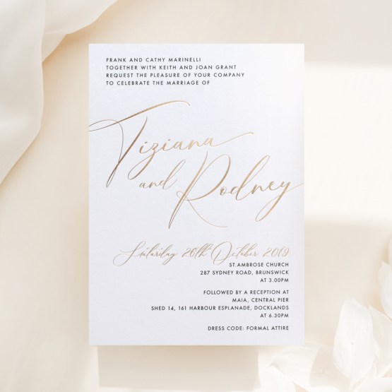
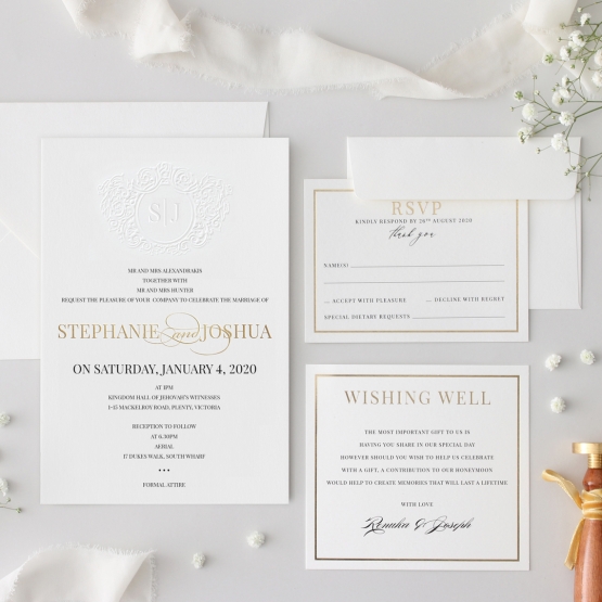
This versatile palette works beautifully whether achieved through foil stamping, embossing, letterpress printing, or simple gold ink—each technique bringing its own character to this classic combination. Whether you're planning a traditional black-tie affair or a modern minimalist celebration, gold and white invitations adapt effortlessly to complement your broader wedding vision.
White Shades Meet Gold Accents
The foundation of exceptional white and gold invitations starts with selecting the right white or cream tone for your vision. Bright white cotton or textured stock creates crisp, high-contrast backgrounds where gold elements truly pop, ideal for modern or minimalist aesthetics. Soft ivory offers gentler warmth, creating that coveted "luxurious yet understated" feeling that's made this our most popular pairing—the subtle cream undertone complements gold beautifully without competing for attention. Deeper cream or champagne-toned papers provide even richer warmth, suited to romantic or vintage-inspired celebrations. Once you've selected your base, gold can be incorporated numerous ways: hot foil stamping delivers that signature reflective shimmer, particularly stunning for names, monograms, or decorative borders; blind embossing paired with gold ink printing adds dimensional texture alongside color; and letterpress combined with gold foil creates striking contrast between tactile impression and metallic shine. This white gold wedding invitations approach allows enormous flexibility—perhaps a fully foiled monogram against bright white, or delicate gold botanical illustrations on soft ivory cotton stock.
A Palette That Suits Every Wedding Style
What makes this golden wedding invitation combination so enduringly popular is its remarkable adaptability across wedding styles. For classic, traditional celebrations, elegant script typography in gold foil against ivory cotton creates timeless sophistication that honors wedding conventions while still feeling special. Black-tie and formal evening weddings often embrace bolder gold applications—full coverage foiling, elaborate borders, or gold-edged paper stocks that command attention and signal the formality of your celebration. Minimalist couples frequently choose this palette too, though with considerably more restraint: perhaps just gold foil on names and dates against clean white space, letting negative space and refined typography carry the design. This white and gold wedding card aesthetic also suits vintage-inspired celebrations beautifully, particularly when gold appears through delicate embossed botanical borders or ornate script lettering reminiscent of earlier eras. Because this combination never feels tied to a specific trend cycle, couples consistently choose gold and white knowing their invitations will look as beautiful in photographs decades from now as they did on their wedding day. Visit our Melbourne showroom to compare different white and cream paper shades alongside various gold techniques, or order our free sample pack to discover why this remains our most beloved color combination.